Frequency Distribution Chart: How to Read and Build One
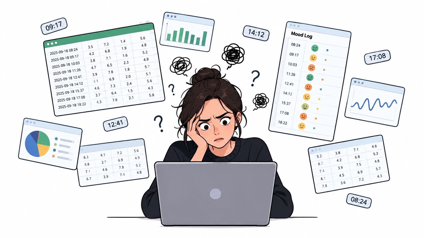
You open your spreadsheet to check whether your mood has been steadier lately, and the file gives you nothing back. Just rows. Dates, ratings, notes, maybe dose timing, maybe skipped days. After enough scrolling, the problem isn't lack of data. It's that raw data has no shape.
That's where a frequency distribution chart earns its place. It turns a pile of entries into grouped counts so you can see where your values bunch up, where they thin out, and whether the pattern looks stable or noisy. If you track wellness data, especially microdosing logs, that shift matters. You stop asking, “What are all these numbers?” and start asking, “Where do most of my days land?”
Table of Contents
- When a Spreadsheet Stops Making Sense
- What a Frequency Distribution Chart Actually Shows
- Histograms, Bar Charts, and Frequency Polygons Compared
- Building a Frequency Distribution Chart Step by Step
- Reading Patterns in a Frequency Distribution Chart
- Common Pitfalls and How Binning Choices Fool the Eye
- Connecting the Concepts to MicroTrack Visualizations
- Quick Checklist Before You Trust Your Chart
When a Spreadsheet Stops Making Sense
You sit down on a Sunday night to review a month of microdosing notes. The spreadsheet looks responsible enough. Dates, dose days, skipped days, mood scores, a few comments like "foggy morning" or "surprisingly steady." Then your eyes start sliding across the rows, and none of it adds up to a clear picture.
That moment is common in self-tracking.
A spreadsheet can store detail well, but it does a poor job of showing shape. If you record daily mood ratings on a ten-point scale, you can read every line and still miss the pattern that matters. Are your days bunching around 6 and 7? Are there two separate clusters, one for rough days and one for better ones? Are your scores getting tighter over time, or do they still swing widely from day to day?
The moment counting becomes more useful than listing
Take a short run of mood scores: 4, 6, 7, 7, 8, 5, 6, 6, 9, 4.
As a list, those numbers are readable. As the list grows to 30, 60, or 120 days, your brain starts sorting them anyway. You notice repeats. You group nearby values. You ask where most days seem to land.
That shift matters. A frequency distribution begins when you stop treating each row as a separate event and start counting how many values fall into the same range. Instead of ten individual mood scores, you might count how many days fell into 3 to 4, 5 to 6, 7 to 8, and 9 to 10.
It works like sorting laundry into baskets before you decide what you have. A pile of clothes feels messy. Separate the pile into lights, darks, and towels, and the pattern becomes obvious.
Raw rows answer "what happened that day." Grouped counts answer "what kind of days happen most often."
A running example from a microdosing log
Use one simple example as you read the rest of this article. You track mood once per day on a ten-point scale while also noting whether the day followed a microdose, an off day, or a skipped entry. After a few weeks, the question is no longer "What did I write on Tuesday the 12th?" The better question is "Where do my ratings usually cluster?"
A frequency distribution chart helps you answer that question without pretending your data are more certain than they are.
That honesty piece matters with wellness tracking. If you only have a few weeks of entries, one unusual stretch can make a pattern look stronger than it really is. If you choose wide bins, the chart can smooth over meaningful differences. If you choose narrow bins, the same chart can make random noise look important. So the goal is not just to build a chart. The goal is to build one that helps you see the pattern and respect the limits of a small sample.
What a Frequency Distribution Chart Actually Shows
A frequency distribution chart answers a simple question: where do your values pile up?
Say your microdosing log has 24 mood ratings. Reading them one by one tells you what happened on specific days. Grouping them into ranges tells you what kind of days you usually have. That shift matters. It turns a diary into a pattern.
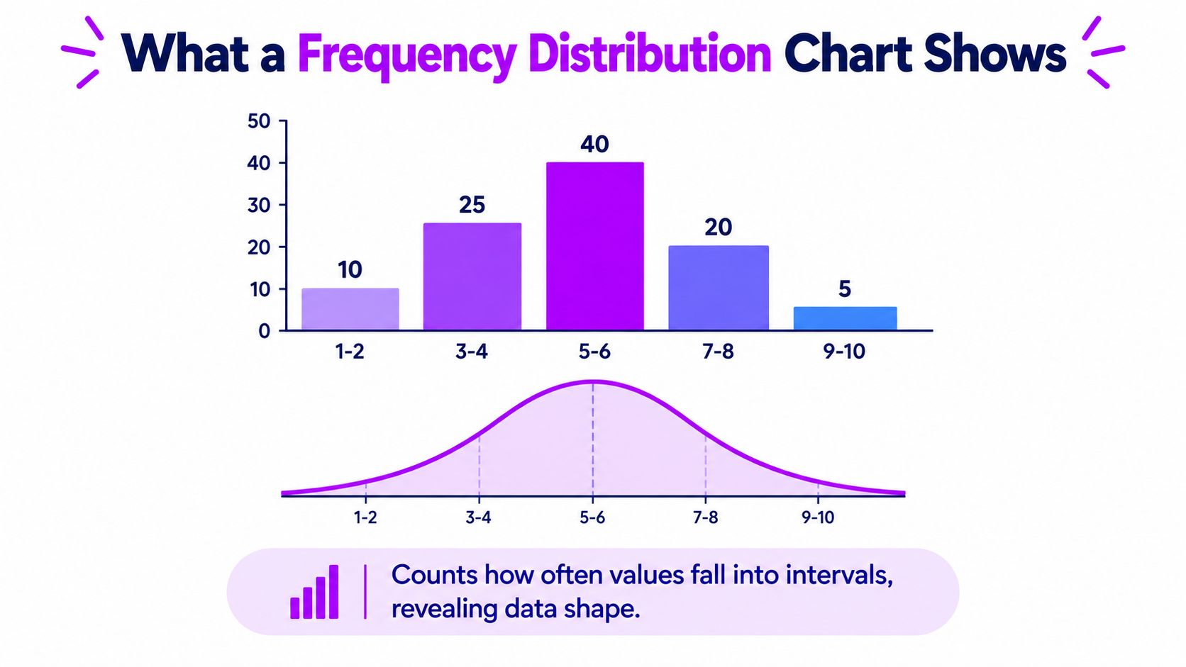
A frequency distribution chart shows how many observations fall inside each interval. The x-axis holds the intervals, often called bins or classes. The y-axis shows either the number of observations in each bin or their share of the whole.
It works like sorting coins into cups by value before counting your change. A mixed handful looks random. Once the coins are grouped, you can see where most of the money sits.
The three parts beginners should spot first
Start by identifying these elements:
- Bins on the x-axis: Value ranges such as mood scores from 1 to 2, 3 to 4, or 5 to 6.
- Bar height or plotted value on the y-axis: The count in each range, or sometimes the percentage of all observations.
- Overall shape: The combined pattern across the bins, such as one peak, two peaks, or a longer tail on one side.
Here is the key idea. The chart does not preserve every day's story. It summarizes the distribution of the values.
That summary is useful, but it also hides detail. If two days both land in the 7 to 8 bin, the chart treats them as equivalent even if one was a dose day and the other followed poor sleep. For self-tracked wellness data, that tradeoff is worth noticing early.
For continuous or grouped quantitative data, statistical references describe histograms as bar graphs of frequency distributions in which bar width shows the class interval and bar height shows the class frequency, with touching bars used to reflect continuity, as explained in this overview of graphical presentation of data.
Frequency, relative frequency, and cumulative frequency
These terms sound formal, but the ideas are plain once you tie them to a real log.
- Frequency is the raw count. If seven mood ratings fall between 7 and 8, the frequency is seven.
- Relative frequency is that count expressed as part of the total, often as a percentage. If seven of 24 ratings fall between 7 and 8, that bin represents part of the full set, which makes comparisons easier when two groups have different numbers of days.
- Cumulative frequency is the running total up to a given bin. If 2 ratings fall in 1 to 2, 5 more in 3 to 4, and 6 more in 5 to 6, the cumulative frequency up through 5 to 6 is 13.
Practical rule: If your dose days and non-dose days have different sample sizes, relative frequency usually gives the fairer comparison.
A quick caution helps here. With a small microdosing log, a chart can look more certain than the evidence really is. Three high ratings in one week can create a tall bar and a strong impression, even if the pattern fades after another two weeks of tracking. A frequency distribution chart shows concentration, not proof of cause.
A quick visual can help if the idea still feels abstract.
Histograms, Bar Charts, and Frequency Polygons Compared
These three chart types get mixed up constantly because they can all show vertical structure. But they answer different questions.
A histogram is for numeric data grouped into intervals. A bar chart is for categories. A frequency polygon connects points across interval midpoints and is useful when you want to compare distributions cleanly.
What changes between them
| Chart Type | Bar Structure | X-Axis Type | Best Use Case | Microdosing Example |
|---|---|---|---|---|
| Histogram | Bars touch | Continuous numeric ranges | Showing the shape of a distribution | Mood scores grouped into ranges such as 1 to 2, 3 to 4, 5 to 6 |
| Bar Chart | Bars are separated | Categories | Comparing counts across named groups | Number of entries logged on dose days, off days, and skipped days |
| Frequency Polygon | Points connected by lines | Numeric bin midpoints | Comparing multiple distributions on one plot | Mood distribution on dose days versus non-dose days |
One easy rule for choosing
If your x-axis labels are names, use a bar chart. If your x-axis is a numeric range split into bins, use a histogram. If you want to compare two distributions without stacking rectangles on top of each other, use a frequency polygon.
That distinction comes from how the data behave, not from visual style. Histograms reflect continuity, so their bars touch. Bar charts represent separate categories, so the bars don't touch.
Why the details matter
The history is a clue here. The term histogram was coined by Karl Pearson and described in his lectures as a “common form of graphical representation” in 1895, while historians also point to William Playfair's 1786 The Commercial and Political Atlas as an important early milestone in bar-chart style visualization, according to this history of histograms summary. Modern charts may look familiar, but they evolved to solve different problems.
For a microdosing example, use each chart on purpose:
- Histogram for dose amount ranges or mood score ranges
- Bar chart for entries by weekday
- Frequency polygon for dose days versus non-dose days across the same score bins
If you choose the wrong one, the chart may still look polished. It just won't answer the question you think you asked.
Building a Frequency Distribution Chart Step by Step
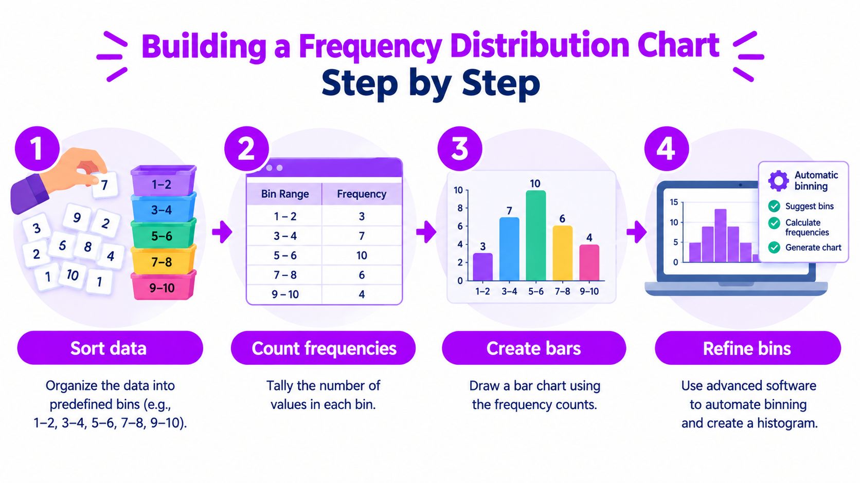
You don't need special software to build a usable frequency distribution chart. Start with the simplest method that matches your comfort level. The key is always the same: define bins, count observations in each bin, and verify that your counts add back to the full dataset.
By hand with a small mood log
Start with a short list of mood ratings. Suppose your scale runs from 1 to 10. Create bins like 1 to 2, 3 to 4, 5 to 6, 7 to 8, and 9 to 10. Then place each rating into one bin and tally marks as you go.
This manual step teaches the logic better than any menu click. You see exactly how the chart is born from grouped counts.
Check one thing before moving on: the total of all bin counts must equal the total number of mood entries. If it doesn't, a value got skipped or counted twice.
In Excel or Google Sheets
Spreadsheets are the next stop because they let you repeat the process without doing all the counting by hand. You can use FREQUENCY, COUNTIFS, or a pivot-table-style summary depending on how your sheet is structured.
A practical workflow looks like this:
- Create one column for raw mood scores.
- Create another column listing your bin boundaries or named ranges.
- Generate counts for each bin.
- Insert a column chart and remove the visual gap between bars so it reads like a histogram.
If you want a spreadsheet-specific walkthrough, this guide on how to calculate frequency distribution in Excel is a useful companion.
In Python with pandas and matplotlib
If your data already live in CSV form, Python makes this fast.
import pandas as pd
import matplotlib.pyplot as plt

df = pd.read_csv("mood_log.csv")

bins = [1, 3, 5, 7, 9, 11]   # captures 1-2, 3-4, 5-6, 7-8, 9-10
plt.hist(df["mood_score"], bins=bins, edgecolor="black")
plt.xlabel("Mood score range")
plt.ylabel("Frequency")
plt.title("Mood score distribution")
plt.show()
Use explicit bin edges when you care about interpretability. Auto-generated bins can be fine for exploration, but self-tracked wellness data often benefit from bins that match the scale you use.
Verification tip: compare the number of plotted observations with the number of non-missing mood scores in your file.
In R with hist or ggplot2
R gives you the same control with slightly different syntax.
Using base R:
mood <- c(4, 6, 7, 7, 8, 5, 6, 6, 9, 4)
hist(mood, breaks = c(1, 3, 5, 7, 9, 11),
     main = "Mood score distribution",
     xlab = "Mood score range")
Using ggplot2:
library(ggplot2)

df <- data.frame(mood = c(4, 6, 7, 7, 8, 5, 6, 6, 9, 4))

ggplot(df, aes(x = mood)) +
  geom_histogram(breaks = c(1, 3, 5, 7, 9, 11), color = "black") +
  labs(title = "Mood score distribution", x = "Mood score range", y = "Frequency")
Before trusting any software output, inspect the bin boundaries. The software can count correctly and still show a misleading story if the bins are a poor fit.
Reading Patterns in a Frequency Distribution Chart
Once the chart exists, most readers jump too quickly to conclusions. A better habit is to scan for five signals in the same order every time: shape, center, spread, skew, and outliers.
Five signals worth reading
- Shape: Does the chart show one main peak, two peaks, or something fairly flat?
- Center: Which bin holds the most observations? That's often the modal bin.
- Spread: Are values packed into a narrow range, or spread across much of the scale?
- Skew: Does one side stretch out farther than the other?
- Outliers: Are there isolated bins far away from the rest?
Suppose your microdosing mood chart shows most ratings clustered between 6 and 8, with a smaller tail on the low side. That suggests many days are landing in a relatively solid band, but there are still some lower-mood days pulling the distribution leftward.
What that pattern can and can't tell you
A cluster around 6 to 8 may mean your days are often moderate to good. A wide spread may suggest inconsistent experience, inconsistent logging, or a real shift in context from day to day. A bimodal pattern might hint that two different conditions are mixed together, such as workdays versus weekends, or dose days versus non-dose days.
It's useful to read these as hints.
It's not safe to read them as proof.
A chart can show that low-mood days exist in a separate pocket. It can't tell you whether sleep debt, stress, protocol changes, or timing drove them.
If a dose-response chart appears right-skewed, one interpretation is that you occasionally logged especially strong effect days. If a mood distribution splits into two humps, one interpretation is that you may be mixing distinct contexts in the same chart.
The next question should always be, “What else changed on those days?”
Common Pitfalls and How Binning Choices Fool the Eye
A clean chart can still be a misleading chart. Beginners often get burned, because the chart looks mathematical and therefore trustworthy. But the visual story depends heavily on how the bins were defined.
The binning scheme is part of the analysis
Statistical agencies recommend bins that are mutually exclusive, exhaustive, and clearly labeled, with examples such as 0 to less than 10 and 10 to less than 20, because ambiguous edges can misclassify observations and distort the visible shape, center, and spread of the data, as explained by the Australian Bureau of Statistics on frequency distributions.
That sounds technical, but the practical meaning is simple. Every observation should have one obvious home.
Four ways charts go wrong
| Mood Bin | 5 Wide Bins | 10 Narrow Bins | Custom Bins |
|---|---|---|---|
| Low range | Broad clump | Split into several smaller bars | May be isolated on purpose |
| Middle range | Looks smooth | May show dips and bumps | Depends on manual choice |
| Upper range | Looks stable | May look spiky | Can be compressed or expanded |
| Edge values | Easy to miss | More visible | Can be exaggerated |
Here's where readers get fooled most often:
- Wide bins can hide structure: Two nearby peaks can blur into one block.
- Narrow bins can invent drama: Ordinary variation can look like meaningful spikes.
- Shifted bin edges can change the apparent center: The same data can look slightly different just by moving where bins start.
- Missing context changes the story: Mood scores without sleep, stress, timing, or dose context can produce a neat picture with a weak explanation.
For a practical review of chart setup habits, this piece on data visualization best practices is worth keeping nearby.
Small self-tracked datasets need extra skepticism
Educational material often teaches the mechanics of range, classes, class width, boundaries, and midpoints, but it rarely spends enough time on the decision tradeoffs behind bin choice, as discussed in this LibreTexts treatment of quantitative frequency distributions. That gap matters more in self-tracking than in classroom exercises.
When your dataset is small, a striking peak may reflect a short-lived habit change or inconsistent logging rather than a durable pattern. Some teaching resources also underplay uncertainty in sparse distributions, which is exactly the problem self-trackers run into with weekly or monthly logs, as noted in this discussion of frequency distributions in learning materials.
If you're working with sparse data, use a simple rule of thumb rather than over-tuning the chart: start with a modest number of bins, inspect whether the result looks too coarse or too noisy, and adjust carefully. Then label the chart clearly so nobody has to guess what the bins mean.
Connecting the Concepts to MicroTrack Visualizations
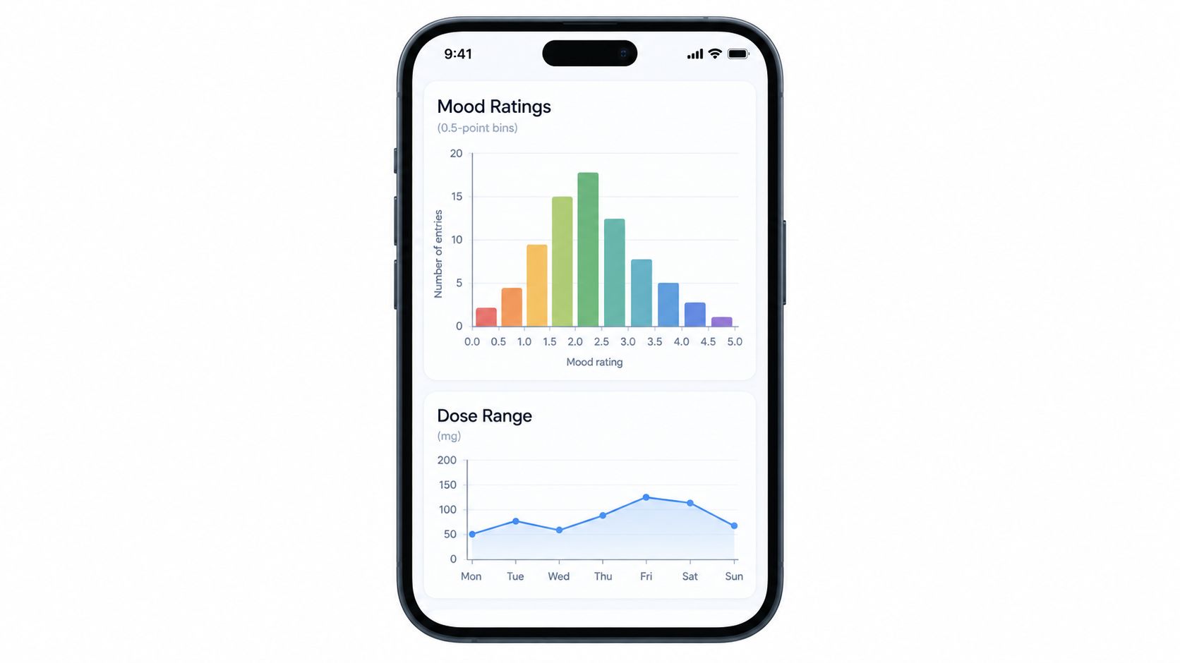
These ideas become easier to trust when you can map them onto actual tracking views you use. In a microdosing journal, a list of mood entries becomes a histogram once ratings are grouped into score intervals. A tally of protocol-day types behaves more like a bar chart because the x-axis is categorical. A time-of-day comparison can act like a frequency polygon or line-based comparison when you want to compare dose days and non-dose days across ordered intervals.
How to audit an app chart instead of just admiring it
When you review a chart in a tracking app, ask the same questions you'd ask of your own spreadsheet:
- What exactly are the bins? If they're hidden, interpretation gets weaker.
- Are the values continuous or categorical? That tells you whether histogram logic fits.
- Does the chart compare like with like? Mixed groups can create false patterns.
One option in this space is MicroTrack's data visualization dashboard, which includes trend, frequency, and time-of-day views for self-tracked entries. The useful habit isn't to trust the app automatically. It's to use the vocabulary from this article, shape, center, spread, skew, and context, to audit what the chart is really showing.
If the chart looks smoother than your lived experience felt, check the binning before you trust the calm-looking picture.
Quick Checklist Before You Trust Your Chart
Most mistakes happen after the chart is built, when someone relaxes and assumes the picture must be right. Run this short checklist every time.
Trust checklist
- Check the x-axis: It should show an ordered numeric range if you're using a histogram-style frequency distribution chart.
- Check the y-axis: Make sure it shows counts, relative frequency, or cumulative frequency clearly.
- Check the bin definitions: They should be visible and unambiguous.
- Check the total count: The sum across bins should match the number of observations included.
- Check for missing data: Know whether blank days or skipped entries were excluded.
- Check comparability: If you compare groups, keep the same binning scheme across them.
- Check your confidence level: Treat sparse datasets as provisional, especially when the pattern looks dramatic.
One final mindset shift
A frequency distribution chart is strongest when you use it as a summary, not a verdict. It can reveal clustering, skew, gaps, and unusual values quickly. It can't replace context, and it can't rescue weak logging habits.
Build the chart. Read it carefully. Then ask what real-world behavior might have produced that shape.
If you want a calmer way to do that with your own log data, MicroTrack gives you structured daily entries, frequency views, time-of-day distributions, and exportable history so you can inspect patterns instead of guessing at them. It's a practical fit for anyone who wants to move from scattered mood notes to charts they can read, question, and use.