Progress Visualization for Microdosing and Mindful Tracking
You've logged a few weeks of microdosing. Your journal contains mood words, sleep notes, dose markers, and occasional reflections, yet the overall picture still feels blurry. One day seemed calm, another felt scattered, and a third brought unusual clarity, but scrolling through the entries doesn't reveal whether those moments form a pattern.
Progress visualization gives those small observations a shape you can inspect without turning them into a score. A line, grid, distribution, or event marker can help you notice changes in mood, sleep, and clarity while leaving room for uncertainty. The point isn't to prove that every shift came from a dose. It's to make your experience easier to see, question, and understand.
Table of Contents
- Why Raw Entries Rarely Tell the Whole Story
- What Progress Visualization Actually Means
- The Main Visual Types You Will See in Trackers
- Why It Matters for Microdosing and Mindful Tracking
- Choosing the Right Visual for the Question You Have
- An Example Workflow With Charts and Templates
- Pitfalls and Privacy Considerations to Keep in Mind
- A Short Checklist to Start Visualizing Today
Why Raw Entries Rarely Tell the Whole Story
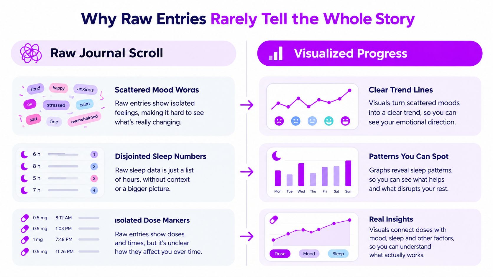
You open your journal and scroll backward. Monday says “steady.” Tuesday includes a sleep note and a quiet dose marker. Wednesday mentions a little mental fog. Thursday has no reflection at all. By the time you reach the beginning of the month, the entries have become a sequence of isolated moments rather than a continuous experience.
That happens because raw logs ask your attention to perform the pattern recognition manually. Your brain reads each entry in order, then tries to remember what came before. A three-day dip can look like a major change, while a slow improvement in sleep latency can disappear among unrelated words and missing details.
From scattered notes to visible shape
Suppose you record mood on a simple scale, add sleep latency, and mark the days you dose. In plain text, a gradual change may feel too subtle to name. On a chart, the mood line might drift downward after several nights of delayed sleep, then return toward its earlier level after rest. The dose markers might sit beside the line without producing any obvious, repeatable separation.
That visual difference matters. Raw entries are the material for insight, not the insight itself. A chart lets your eye compare position, height, spacing, and direction at the same time. Subtle mood gradients, sleep latency creep, protocol adherence cues, and gaps in logging become visible as shapes rather than separate facts.
Practical rule: Treat a chart as a prompt for reflection, not a verdict about what caused your experience.
A useful visualization won't tell you that a practice worked or failed. It can show that low-mood days clustered during a particular stretch, that sleep became more variable, or that your logging became less consistent. You still need context, patience, and honest notes to interpret those signals.
What Progress Visualization Actually Means
Progress visualization is the deliberate conversion of logged information into a visual form that makes change easier to inspect. You might represent mood as a line, sleep quality as bars, daily observations as a colored grid, or dose days as markers placed over another measure.
The distinction from a raw log is simple. A raw log preserves sequence, wording, and detail, but makes comparison laborious. A visualization compresses those details into a structure where trends, cycles, gaps, and unusual observations can stand out quickly.
It's also different from a performance dashboard. A dashboard usually centers on targets, key performance indicators, thresholds, and status labels. Mindful tracking sits somewhere else. It uses visual structure to support attention, curiosity, and memory, not to grade the person doing the tracking.
Why lines and bars keep appearing
Line charts connect observations across ordered time, allowing you to follow slope, drift, pauses, and reversals. The Office for National Statistics guidance on line charts recommends them for displaying trends over time, especially when you want to compare how multiple series move relative to one another.
Bar charts answer a different question. They compare discrete categories, such as average mood by weekday or the number of entries associated with different sleep-quality labels. The historical development of these familiar forms is part of a longer data-visualization story. Michael Friendly's history of statistical graphics traces important milestones to 1644, the 18th century, and William Playfair's late-18th-century contributions to line and bar charts, followed by what Friendly describes as the “Golden Age” of statistical graphics in the latter half of the 19th century.
The practical lesson is older than any app: people want to know how much something changed and when it changed. For microdosing, progress visualization can become a quiet meditation aid. You look, notice, and ask a better question. You don't need to turn the result into a report card.
The Main Visual Types You Will See in Trackers
Different charts reveal different parts of an experience. Choosing one because it looks polished can leave you with a beautiful answer to the wrong question.
Trend lines for trajectory
A trend line plots one or more variables across consecutive days or weeks. Use it for questions such as, “How has my mood shifted?” or “Is sleep quality drifting as my routine changes?”
A line can reveal a gradual slope, a sudden interruption, or a delayed response that isn't obvious in a daily list. If you plot mood and sleep together, you can inspect whether their movements tend to coincide. Keep the interpretation modest. Similar movement indicates timing and association, not proof of cause.
Heatmaps for rhythm
A heatmap places observations into a grid and uses color to represent intensity. Rows might represent weeks, while columns represent weekdays or hours. This makes recurring structures easier to scan than a long sequence of dots.
Use a heatmap to compare mornings with afternoons, weekdays with weekends, or dose days with non-dose days. It's especially helpful when the pattern is cyclical rather than steadily improving. A line may show the month's overall direction, while a heatmap shows the rhythm inside that direction.
Distributions for variability
Histograms, box plots, and dot strips summarize how often values fall within ranges. They answer questions about spread and typical experience, such as, “How variable is my sleep?” or “Do my clarity ratings usually cluster near one level?”
A distribution can challenge an overly positive memory. You may remember a few exceptionally clear days, but the chart can show whether those days were typical or unusual. For subjective measures, that distinction is valuable because a single memorable entry can dominate your impression of a whole period.
Event overlays for timing
Event overlays place markers for doses, rest days, schedule changes, exercise, sleep disruptions, or other meaningful events on top of a trend. They're useful when you're asking whether an observation tends to occur before, during, or after a particular event.
For example, you might inspect whether clarity changes after a Stamets-style fourth-day cycle. The overlay doesn't establish that the cycle caused the change. It puts timing and outcome in the same visual field, so you can examine the relationship without relying on memory.
| Visual Type | Best Question Answered | Example Use |
|---|---|---|
| Trend line | How am I changing over time? | Follow mood or sleep across consecutive days |
| Heatmap | What rhythm or cluster keeps appearing? | Compare clarity by weekday and hour |
| Distribution | How variable is this measure? | Inspect the range of sleep or mood ratings |
| Event overlay | What happens around a marked event? | Place dose markers over a focus trend |
You can also explore the practical distinction between time-based comparisons and other chart choices in this guide to time distribution charts. The simplest switching rule is effective: lines for trajectory, heatmaps for rhythm, distributions for range, and overlays for timing.
Why It Matters for Microdosing and Mindful Tracking
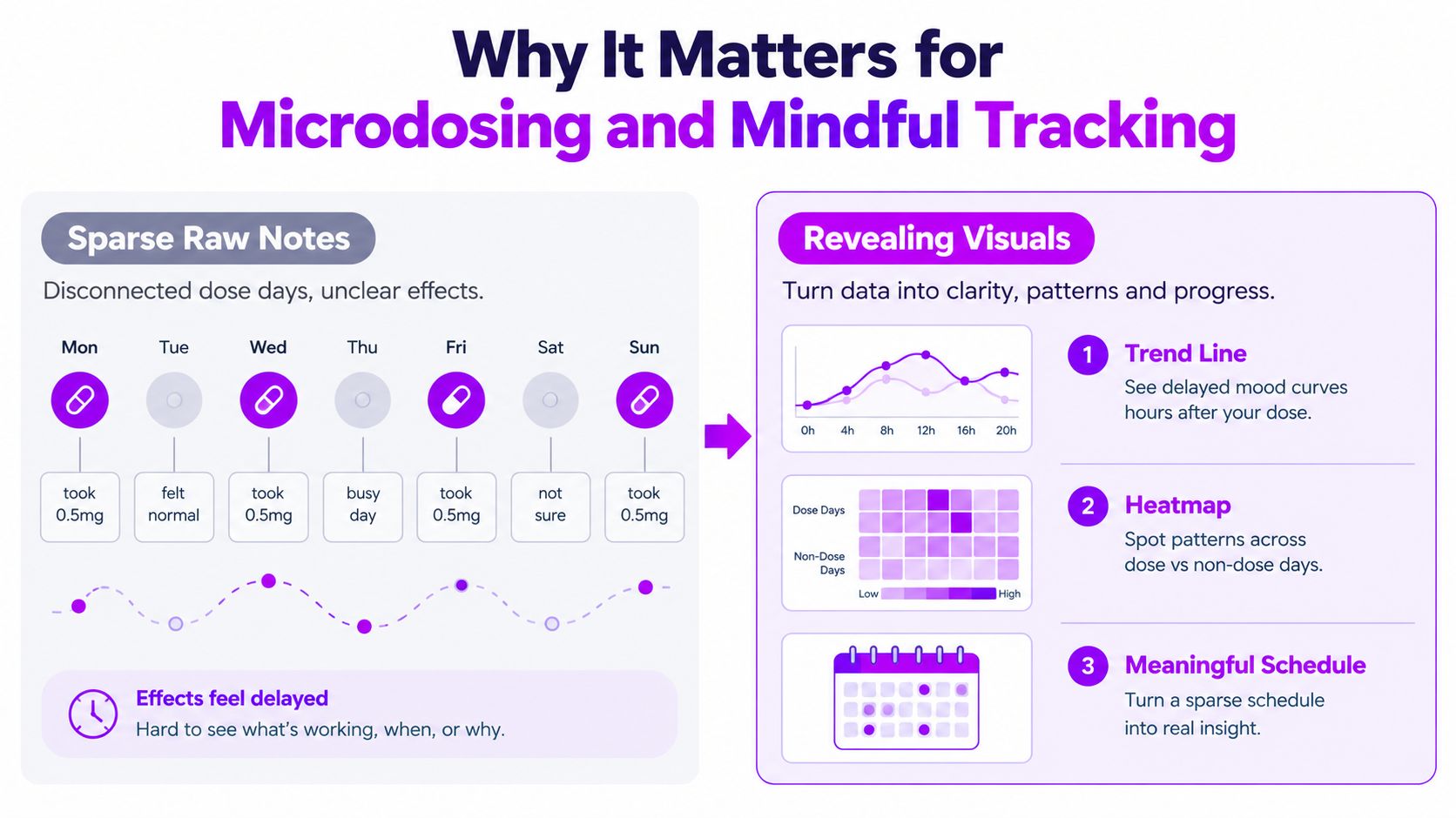
Microdosing schedules create a difficult reading problem. Dose days are separated by rest days, and an experience may feel different later rather than immediately. A raw note from the morning may not connect easily to an evening reflection or the following day's sleep.
A trend line can place those observations in sequence. A heatmap can show how practice days and off days sit within a broader rhythm. A calendar view can make a sparse schedule legible without treating every blank day as a failure.
Seeing the schedule without judging it
Protocol markers add useful context. The Fadiman protocol is commonly described as one day on and two days off, while the Stamets protocol is described as four days on and three days off. A visualization can show whether your actual entries resemble the schedule you intended, where life interrupted it, and whether your reflections become more or less consistent during certain phases.
That's different from chasing perfect adherence. A missed day might reflect travel, poor sleep, stress, or a deliberate choice to pause. Seeing it on a calendar helps you investigate the context instead of rewriting the story as either success or failure.
Subjective signals can still be tracked carefully. Mood steadiness, sleep quality, creative flow, and clarity can become separate threads across the same period. The quantified-self visualization study, which analyzed 188 screenshots containing 243 charts and graphical feedback items, identified 21 unique visualization types, with line charts, bar charts, and custom visualizations among the most commonly used.
A mood-tracking app study found that 29 apps offered mood visualizations during reflection, with bar and pie graphs among the most common formats, alongside lists, line graphs, calendars, maps, and mood meters, as described in this mood-tracking app research. Familiar forms can lower the effort needed to reflect, but they shouldn't force a subjective experience into a single score.
A chart can help you notice a low-mood cluster or a possible focus pattern. It can't decide what the pattern means. Mindful tracking keeps the person in the loop.
Choosing the Right Visual for the Question You Have
Start with the question, not the chart. If you begin with a dashboard full of lines, colors, and badges, you'll be tempted to interpret whatever happens to look prominent. A focused question gives the visual a job.
For a six-week mood question, use a line chart. A gentle moving average can make the broad direction easier to see while the underlying observations preserve day-to-day variation. If you want to know which hours feel clearest, use a heatmap organized by time of day. If you're asking whether sleep is stable or erratic, choose a distribution rather than a trend line.
A practical matching framework
| Question you want answered | Best visual type | What it reveals |
|---|---|---|
| How has mood shifted across the period? | Trend line | Direction, drift, pauses, and reversals |
| Which days or hours feel different? | Heatmap | Rhythms, clusters, and recurring contrasts |
| Is sleep becoming more consistent? | Distribution | Spread, typical values, and unusual observations |
| What happens around dose days? | Event overlay | Timing relationships and possible lag |
| Did I follow the intended schedule? | Calendar or event view | Gaps, phases, and adherence context |
Use separate views when the questions are separate. A line chart can show change over weeks, but it won't explain the full range of daily values. A distribution can show variability, but it won't tell you whether the values rose gradually or changed suddenly.
“One question, one primary visual” is a useful discipline for personal tracking.
For design principles that help keep those views readable, see these data visualization best practices. The central idea is restraint. Don't stack mood, sleep, dose, exercise, caffeine, weather, and every journal tag into one crowded display unless you have a specific reason to compare them.
A visualization should reduce cognitive load, not create another puzzle. If you need a legend to remember what every color means, simplify the view before drawing conclusions.
An Example Workflow With Charts and Templates
Consider six weeks of entries containing mood, sleep, clarity, and dose-day markers. The useful approach isn't to produce every possible chart. It's to build a sequence in which each view answers a different question.
Start with the broad movement
First, plot mood and sleep by day. Add a seven-day average if the daily values make the line too restless, but keep the original observations visible. The smoothed line can help you see whether the baseline is drifting upward, downward, or holding steady, while the raw points preserve the texture of the experience.
Next, examine clarity by hour of day. A heatmap may reveal that Tuesday and Thursday mornings carry higher clarity ratings than late afternoons. That observation isn't a conclusion about the practice. It's a prompt to ask about sleep timing, workload, meals, expectations, and the structure of those days.
Add context, then test stability
Place dose markers on the mood or clarity trend. Look for whether dose days sit above the surrounding pattern, whether changes appear later, or whether markers cluster around days that already felt different. The overlay makes timing visible without pretending that timing proves causation.
Then use a distribution plot for sleep hours or sleep-quality ratings. If the values cluster more tightly, your rest may be steadier. If they remain widely spread, an apparent improvement in the average may conceal continued volatility.
MicroTrack can support this workflow with weekly and monthly trend summaries, time-of-day distributions, and lightweight pattern detection for recurring observations such as post-dose days with high focus. It also supports structured logging around dose details and later reflections, so the initial entry and the end-of-day interpretation don't have to compete for attention.
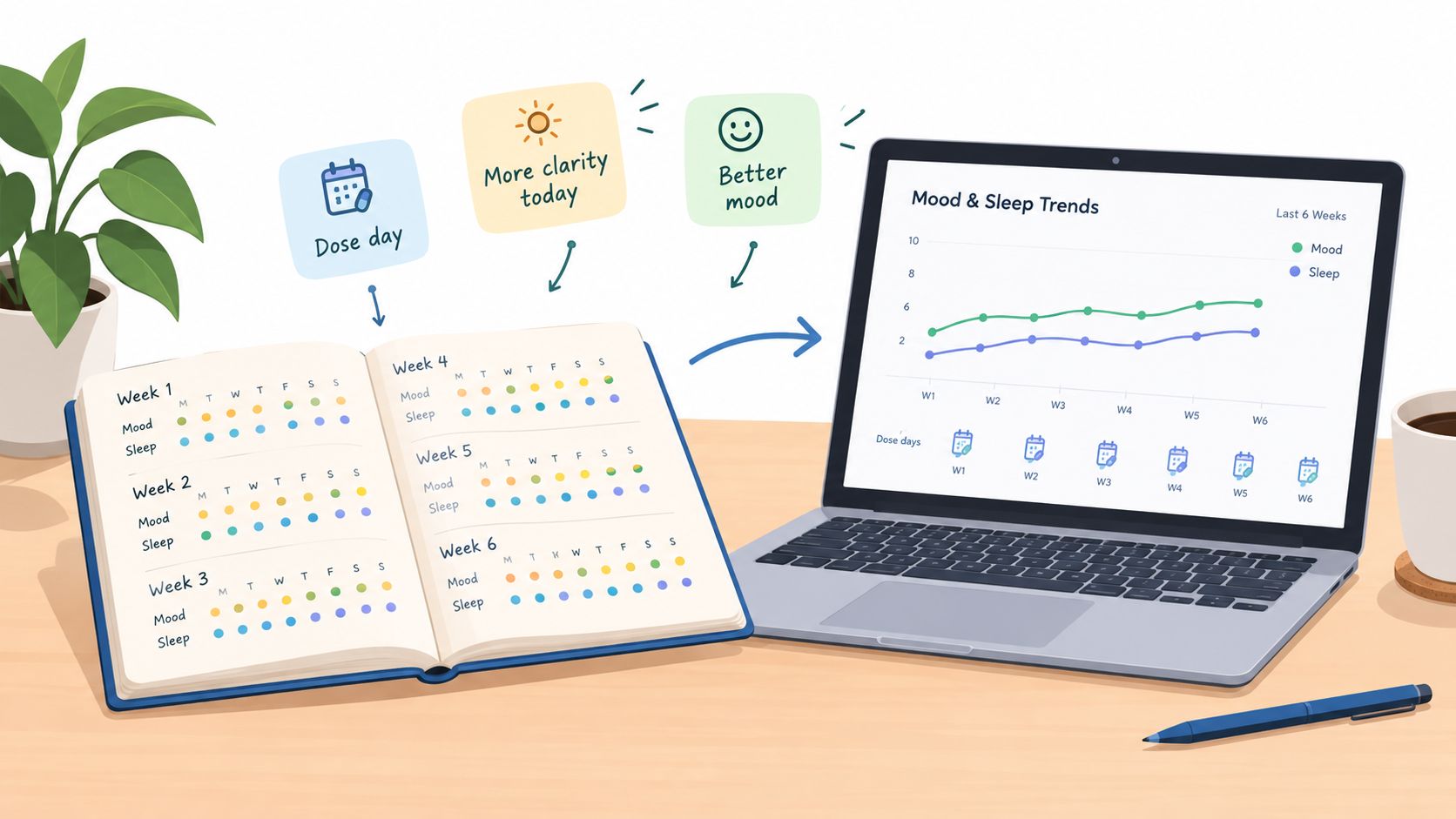
Templates make the process repeatable. You can begin with a mood trend, add a clarity heatmap when a timing question arises, and use a distribution only when you need to investigate variability. If you want to work in another analysis environment, a CSV data export workflow can keep your records available for further inspection.
Keep the sequence visible: first describe the movement, then inspect timing, then examine variability.
That order helps prevent premature storytelling. You see what changed, where it changed, and how consistent the change was before attaching a strong interpretation.
Pitfalls and Privacy Considerations to Keep in Mind
A chart can make a messy record look more certain than it is. Smooth lines may connect observations across missing days, creating false continuity. Bright color scales can make small mood differences appear dramatic, while an unbroken streak can become a psychological target rather than a neutral record.
Clinical and behavioral graphing guidance recommends showing raw data points, interruption markers, and separate pre- and post-event trend lines when interpreting interrupted patterns. The guidance on graphing single-case and interrupted time-series data also warns that joining points with lines can obscure the meaning of interruptions. For personal tracking, the same principle applies: mark missing days rather than filling them in.
Three interpretation traps
- False continuity: A connected line across missing entries can imply that you observed a steady process when you didn't.
- Causal overreach: A clearer week may follow a dose, but sleep, exercise, stress, expectations, and other changes may also have moved.
- Scoreboard thinking: A mood scale compresses lived experience into a limited range. It's a useful signal, not a complete account of wellbeing.
A separate concern appears when long histories are compressed into weekly or monthly views. Research on time-series downsampling recommends MinMax or LTTB aggregation for preserving visual fidelity, with MinMax often showing better visual stability as output size increases, as discussed in this time-series visualization research. The practical lesson is to inspect both detail and summary views before trusting a simplified shape.
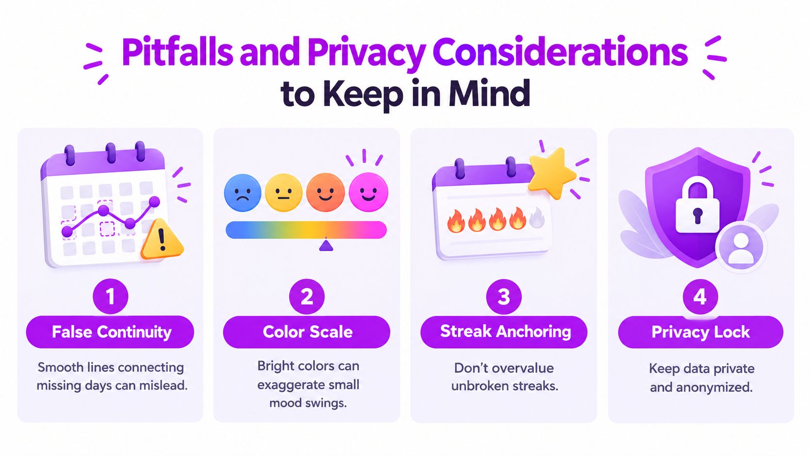
Privacy deserves the same care as interpretation. Microdosing journals may contain information about mood, mental health, medication, routines, and personal circumstances. Favor on-device storage where appropriate, encrypted synchronization, granular sharing controls, and anonymized charts. Check the rules that apply in your region, and remember that self-tracking can supplement professional care but doesn't replace clinical advice.
Use three guardrails: question every dip, compare protocols only with reasonably matched baselines, and audit who can view each chart. Your data should support reflection, not expose you.
A Short Checklist to Start Visualizing Today
Set up one modest view before you add another field to your journal. The aim is to notice patterns gently, not to optimize yourself into constant measurement.
- Pick one question. Start with something concrete, such as, “How does day one after a dose compare with day four?”
- Match the visual. Use a trend line for change across weeks, a heatmap for day-of-week mood patterns, a distribution for variability, and an event overlay for dose timing.
- Establish context. Capture at least two baseline weeks before drawing strong conclusions.
- Log three core fields. Record dose timing, mood or sleep, and a one-word note consistently.
- Review at two speeds. Take a 60-second weekly glance, then do a 5-minute monthly pattern scan.
- Revisit the question. Every four weeks, ask whether the chart still serves your curiosity and rotate the visualization when a default view becomes stale.
The first useful chart is often the simplest one. Let it show what happened, preserve uncertainty where the record is incomplete, and leave enough room for your own reflection.
MicroTrack turns daily entries into trend visualizations, time-of-day distributions, protocol-aware calendar views, and lightweight pattern detection without streaks or gamification. Use it to build a calmer record of mood, sleep, clarity, and dose timing, then visit MicroTrack to start visualizing your practice with a free account.