Long Term Trend Analysis for Mood and Microdosing Data

You've logged your mood for weeks. The entries are all there, but the pattern refuses to behave. One day feels like an 8 out of 10, the next drops to a 3, and a stressful conversation or poor night of sleep can make the whole chart look like a seismograph. You keep asking the same question: is the practice helping, or am I just getting better at noticing random variation?
Daily ratings are useful records, but they're poor evidence when you inspect them one by one. Long term trend analysis gives those observations a different job. Instead of asking whether today was better than yesterday, you look for a persistent direction after short-term noise, repeating cycles, and unusual days have been accounted for.
This approach translates well to a microdosing journal, but it needs adjustment. Personal data is sparse, subjective, and full of interruptions. The workflow below focuses on cleaning the record, choosing sensible smoothing, separating schedule effects from genuine movement, checking for false trends, and interpreting reversals without turning a chart into a verdict.
Table of Contents
- Why Your Microdosing Journal Deserves Long Term Trend Analysis
- Getting Your Mood Data Analysis-Ready
- Choosing a Smoothing Window to Clarify the Underlying Trend
- Separating Schedule Cycles from Genuine Long-Term Movement
- Testing Whether a Trend Is Statistically Real
- Visualizing and Interpreting Your Mood Trends
- Pitfalls to Avoid and Habits That Keep Your Analysis Honest
Why Your Microdosing Journal Deserves Long Term Trend Analysis
You open your journal late at night and scroll through a month of mood dots. The ratings jump from high to low and back again. A few positive reflections make you feel encouraged, while a rough weekend makes you wonder whether the entire experiment has failed. Your eyes naturally search for a story, but the latest entries tend to dominate the story you find.
That's the first problem with eyeballing daily data. Short-term salience overwhelms long-term direction. A bad day feels like evidence against progress, even when it sits inside a broader period of gradual improvement. Conversely, a few unusually good days can create false confidence.
Long term trend analysis treats your journal as a time series. You collect repeated observations, preserve their order, and try to distinguish four different ingredients:
- Trend: The persistent direction in mood or another measure.
- Seasonal pattern: A repeating schedule or calendar effect.
- Cyclical movement: Broader rises and falls that don't repeat at a fixed interval.
- Irregular noise: Events such as poor sleep, conflict, illness, or an unexpectedly demanding day.
This decomposition became central to quantitative trend work when economists and statisticians moved beyond simple curve fitting and began separating time series into trend, seasonal, cyclical, and irregular components. The historical development established a useful discipline, use long spans of data, isolate persistent direction from short-term noise, and quantify movement instead of relying on intuition. The National Bureau of Economic Research's historical account of time-series analysis describes that shift and its importance to later forecasting practice.
What the raw dots can't tell you
A daily mood score answers, “How did I feel when I logged this?” It doesn't automatically answer, “Is my baseline changing?” Those are different questions.
Suppose your ratings are higher on dosing days but lower after difficult workdays. Or perhaps your reflections become more detailed because you're paying closer attention. Without organizing the data, you may attribute the whole movement to the protocol when sleep, expectations, or a change in your rating habits played a role.
A structured journal helps because each entry can represent a comparable observation rather than a memory reconstructed later. Consistency doesn't remove subjectivity, but it makes subjectivity easier to inspect. You can compare similar periods, isolate a schedule, and return to the original context when an unusual point catches your attention.
A practical introduction to trend analysis is useful here, but the personal version needs one extra layer: context. Your chart should help you ask better questions, not pretend that mood is a laboratory instrument.
By the end of the workflow, you should be able to export a clean history, compare raw observations with smoothed lines, check whether a repeating schedule explains the apparent movement, and decide whether a reversal deserves attention or more observation.
Getting Your Mood Data Analysis-Ready
A model can't rescue inconsistent input. Before fitting a line or calculating an average, make sure the entries mean roughly the same thing across the period you're comparing.
MicroTrack's structure supports this preparation in a practical way. You can record mood on a 10-point scale, enter dose details in the moment, and add reflections later when the day has enough distance. The searchable, filterable history lets you narrow the record before exporting it as a CSV file. That separation matters because an immediate dose note and a later reflection answer different questions.
Start with the question you want the dataset to answer. If you want to assess one protocol, filter for that schedule rather than mixing it with custom days, skipped doses, and unrelated experiments. You might isolate Fadiman's 1-on/2-off pattern, remove a period interrupted by travel, or compare entries made at a consistent time of day.

A simple preparation sequence
Define the comparison. Decide whether you're studying a protocol, a calendar period, a time of day, or your overall mood trajectory. Don't combine every available entry just because the export makes it easy.
Use filters before export. Exclude interrupted periods only when you can explain why they're different. Keep a separate copy of the full history so you don't lose context.
Preserve both phases. Dose details can capture timing and protocol adherence. Later reflections can record sleep, stress, focus, anxiety, and events that a score alone won't explain.
Export the selected history. A CSV data export workflow gives you a portable dataset for a spreadsheet, Python, or another analysis tool.
Create a data dictionary. Write down what each column means, how the mood scale is interpreted, and which entries were excluded. Future-you shouldn't have to reverse-engineer your own experiment.
A careful workflow checks comparability before modeling. The observations should have a reasonably consistent interval, enough coverage to support the question you're asking, and a stable measurement method. Guidance on environmental time-series work makes the same point: verify interval consistency, coverage duration, and measurement-method stability before fitting a trend. The practical guidance on preparing repeated observations also warns that inconsistent measurement and autocorrelation can make an apparent trend misleading.
Three checks that prevent bad conclusions
Interval consistency comes first. Daily entries and sporadic entries don't carry the same meaning. If you logged every day early on but only recorded difficult days later, the apparent decline may describe your logging behavior rather than your mood.
Coverage duration is a judgment call, not a magic threshold. A short, uninterrupted record may show a temporary phase, but it can't carry the same confidence as a longer record that includes ordinary and difficult periods.
Measurement stability is easy to overlook. Ask whether a 5 out of 10 meant the same thing at the start and end. Did you begin rating more harshly? Did you change the question from “How is my mood?” to “How productive was I?” If the scale changed meaning, annotate the break instead of smoothing over it.
Choosing a Smoothing Window to Clarify the Underlying Trend
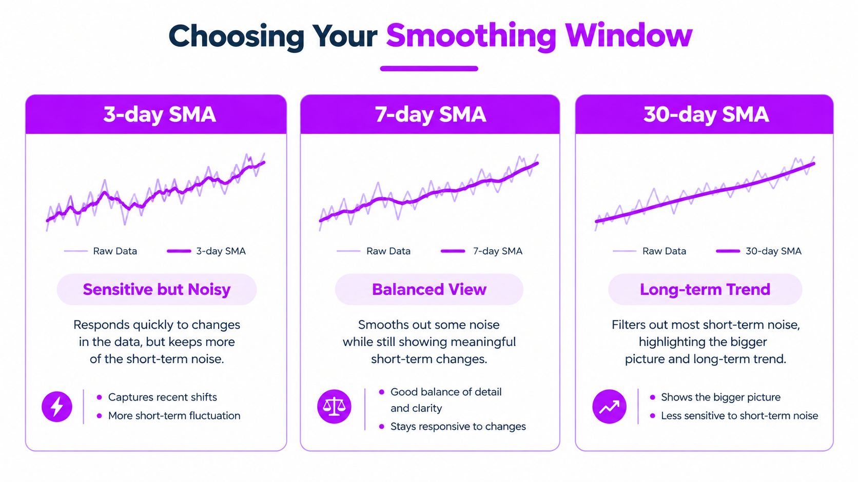
Smoothing can change your interpretation even when not a single mood entry changes. A short window stays close to daily experience but moves sharply. A long window produces a steadier baseline while potentially hiding a recent shift. In a sparse microdosing journal, that trade-off matters because a few unusual ratings can otherwise dominate the story.
A simple moving average assigns equal weight to every observation inside a fixed window. Averaging consecutive data points reduces short-term noise, so one unusually high or low day has less influence on the displayed direction. Exponential smoothing weights recent observations more heavily. It reacts faster when current behavior matters more than older entries. OpenStax's explanation of moving averages and exponential smoothing explains the distinction clearly.
Choose the window for the question
A 7-day window is a practical view of whether the latest week differs from the preceding rhythm. It responds quickly enough to show a developing change, but it can still reflect poor sleep, weekday effects, or one disruptive event. For a personal journal, that makes it useful for monitoring recent movement, not for declaring a durable outcome.
A 30-day window gives a calmer view of baseline movement. It can help answer whether mood has generally drifted upward or downward across a longer period. The cost is delay. When a new phase begins, the average still contains many older observations, so a reversal may become visible only after it has been underway.
A 3-day window is more sensitive still. It can reveal local movement around a dosing cycle, but it is easy to mistake a short run for a meaningful change. Use it to inspect nearby behavior, then compare it with a longer window before interpreting the pattern.
| Method | Best For | Watch Out For |
|---|---|---|
| Simple moving average | Showing a stable direction with equal weighting across the selected window | It can lag after a turning point and flatten meaningful short-lived changes |
| Exponential smoothing | Giving recent mood observations more influence when current behavior matters | It can overreact to a run of unusual entries and make a temporary shift look structural |
| Ordinary least squares regression | Establishing a simple baseline slope across the selected period | Outliers and changing trend shape can pull the line away from the typical experience |
Use regression as a baseline, not a final answer
Ordinary least squares regression offers a straightforward summary of direction across a selected period. It estimates whether observations have generally moved upward or downward, and its slope provides a common reference when comparing two filtered datasets.
A single slope assumes that one broad direction describes the whole period. Mood may rise, plateau, and fall instead. The average line can then conceal the turning points that matter more than the overall direction.
MicroTrack's filters can help create comparable views before analysis, while its CSV export gives you a way to inspect the same entries with your chosen smoothing method. For sparse personal data, compare at least four views:
- Raw points preserve day-level variability and show whether the smoothed line is hiding unusual entries.
- A moving average reduces day-level noise and clarifies short-term direction.
- An exponential line gives recent observations greater influence when the latest phase matters most.
- A regression baseline summarizes the broad direction without pretending to explain every change.
A review of trend-extraction techniques covers regression, locally weighted polynomial regression, moving averages, wavelet decomposition, and empirical mode decomposition. It presents ordinary least squares as a relatively simple baseline and shows why different trend shapes call for different methods. The academic review of time-series trend extraction supports matching the method to the structure instead of applying one smoothing rule by default.
Write the decision in plain language before choosing a window. “I want a responsive view of recent changes” points toward exponential smoothing or a shorter average. “I want to understand my baseline across a protocol period” points toward a longer window and a regression comparison. The model should answer the question you set, not manufacture certainty from noisy entries.
Separating Schedule Cycles from Genuine Long-Term Movement
Microdosing schedules create patterns before mood enters the picture. A Fadiman 1-on/2-off rhythm repeats across three days. A Stamets 4-on/3-off stack creates a weekly structure. Weekdays and weekends add another layer, while sleep debt, social demands, and monthly energy rhythms can create less obvious cycles.
If you ignore these components, a repeating schedule can look like a trend. For example, if your best ratings consistently arrive after rest days, a chart may suggest gradual improvement because the proportion of rest-day entries changed across the period.
Label the cycle before interpreting the line
Start by adding schedule and calendar fields to the exported data. Mark dose day, rest day, weekday, weekend, sleep quality, and major disruptions. You don't need to build a complicated model immediately. A grouped comparison can reveal whether high or low ratings cluster around a repeating condition.
Ask three questions:
- Does the movement repeat at a recognizable interval? Repetition points toward seasonality or schedule effects.
- Does the pattern remain after grouping comparable days? If the apparent rise disappears when dose days and rest days are viewed separately, the original line mixed different states.
- Does the baseline shift within each group? A genuine long-term movement should often appear as a change in comparable categories, not only in the combined series.
A static trend model makes sense when the series has no meaningful seasonal component. Available model families include linear, quadratic, exponential growth or decay, and S-curve models, and the shape of the underlying data should determine the choice. Minitab's guide to time-series trend methods outlines these options.
When one line isn't enough
A linear fit works when the direction is reasonably steady. A quadratic fit can represent curvature, but it may exaggerate a turning point if the record is short. Exponential growth or decay can describe accelerating movement, yet personal mood data rarely justifies that interpretation without strong evidence.
If the direction changes, use piecewise thinking. Split the history around a plausible change point, compare the slopes before and after it, and check whether the shift survives schedule and context controls. This is more honest than forcing one elegant curve over a messy record.
The question isn't “Which model proves improvement?” It's “Which components could have produced this shape?” Only after schedule cycles have been separated can you assess whether the remaining movement resembles a genuine long-term change.
Testing Whether a Trend Is Statistically Real
The most convincing mood chart can still be wrong. Daily observations are usually autocorrelated, meaning today's mood is related to yesterday's mood. A difficult day can affect sleep, motivation, and tomorrow's emotional state, so consecutive points aren't independent pieces of evidence.
That matters because many simple trend calculations behave as if every observation arrived from an unrelated draw. Ignoring autocorrelation can make a run of connected days look like a stronger trend than it really is. The result is a false positive, a pattern that appears statistically persuasive because the analysis treated dependent observations as independent.
Think in terms of persistence
A useful plain-language test is to ask whether the pattern survives a change in how you count time. If a trend appears only when every day is treated as independent, but weakens after accounting for serial dependence, don't treat the original result as decisive.
Pre-whitening and related corrections reduce the influence of autocorrelation before trend estimation. You don't need to implement them by hand to use the principle. If you're working in Python or a statistical package, choose a time-series method that tests for autocorrelation and adjusts the inference rather than applying an ordinary slope test automatically.
Practical rule: A smooth run of mood ratings isn't the same as repeated independent confirmation. Treat connected observations as connected.
Outliers create a second trap. A bad night of sleep, argument at work, illness, or major deadline can pull a least-squares slope toward itself. That doesn't mean the day should be deleted. It means the analysis should show how sensitive the result is to that observation.
Prefer robust summaries when the journal is spiky
Statistical guidance describes different estimators for different data conditions. Least squares uses the mean slope, least absolute deviations and Sen-Theil methods use a median-based perspective, and quantile regression examines percentiles. This overview of trend estimators explains why the estimator matters when observations contain outliers or nonlinearity.
For a personal journal, compare the ordinary regression slope with an alternative less affected by outliers. If both point in the same direction, your conclusion is less dependent on one extreme day. If they disagree, that disagreement is useful information. It tells you the apparent trend may be driven by unusual observations or a changing distribution.
A practical decision rule looks like this:
- Act cautiously when the direction appears across raw points, a smoothed view, and a summary, while schedule and context remain comparable.
- Keep observing when only one method shows movement or when a few unusual days determine the slope.
- Rebuild the dataset when intervals, scale meaning, or protocol conditions changed during the period.
- Avoid protocol changes based on one reversal. First check whether the deviation persists after accounting for autocorrelation and recurring cycles.
Statistical significance doesn't prove that microdosing caused a mood change. It only helps you judge whether the observed pattern is distinguishable from the noise under the assumptions of the analysis.
Visualizing and Interpreting Your Mood Trends
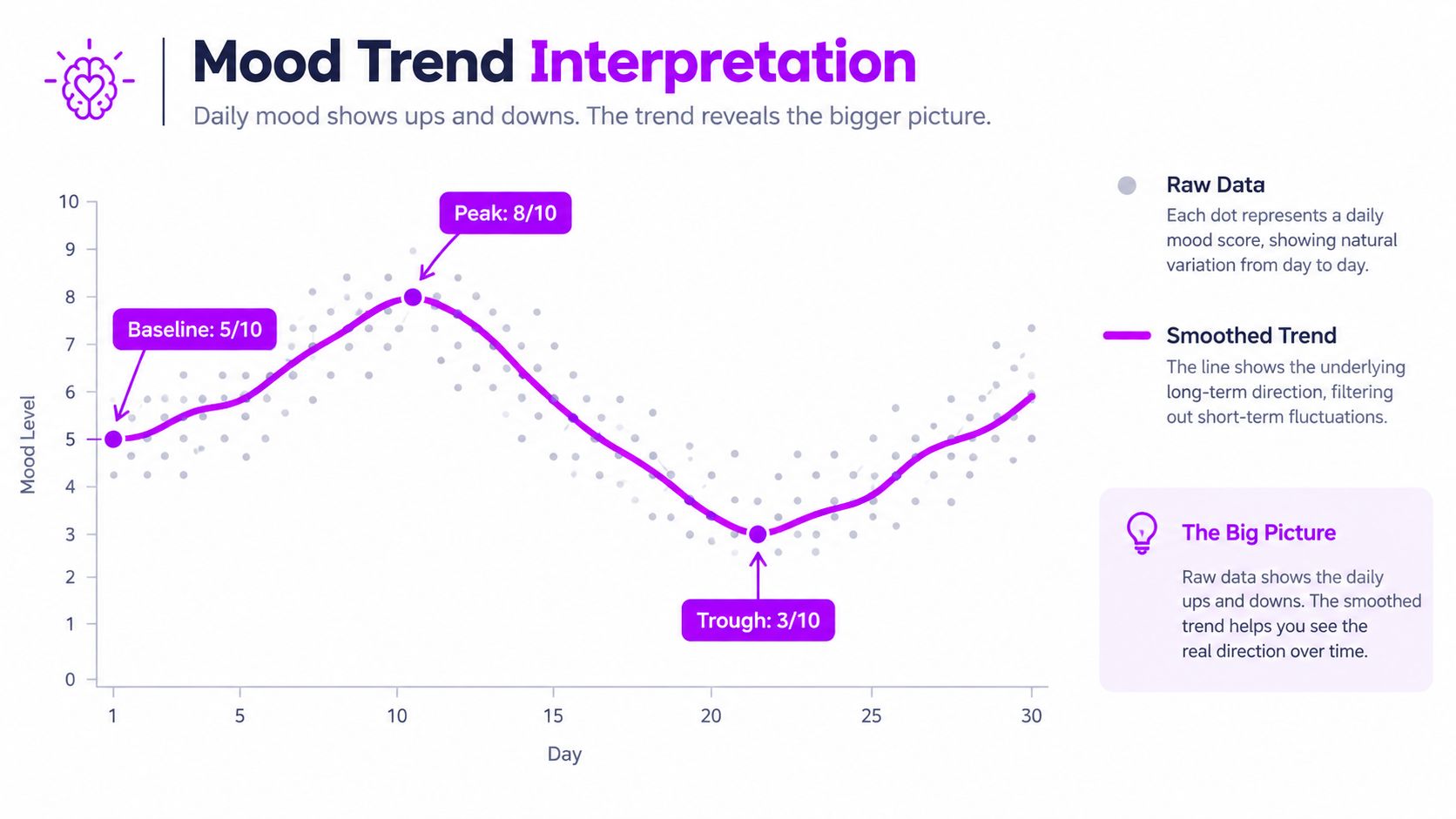
A useful chart keeps the noise visible while making the direction easier to read. Plot the raw daily points in a quiet color, then overlay a smoothed trend line with a clear legend. If you show only the line, you lose the information that tells you whether the line represents steady movement or a few isolated extremes.
Confidence bands add another layer of honesty. A narrow line without uncertainty implies more precision than a personal journal can usually support. Bands won't solve every modeling problem, but they show where the estimated direction is less certain and make abrupt conclusions harder to justify.
Match the chart to the decision
Use a shorter view when comparing protocol conditions or investigating a recent change. Use a broader view when asking whether your baseline has shifted across a much longer period. A chart can answer one question well and another badly, so label the timeframe and the filtered population directly on the chart.
Frequency and time-of-day distributions can expose patterns that a single mood line hides. If low ratings cluster after late nights, the right next step may be better sleep notes rather than a new dosing interpretation. If a pattern appears only at one time of day, compare like with like before calling it a general mood trend.
MicroTrack provides trend visualizations across weeks and months, frequency and time-of-day distributions, searchable history, and lightweight pattern detection. Those views are useful for exploration, while a CSV analysis lets you test alternative windows, add context fields, and inspect sensitivity to exclusions. Its progress visualization guidance fits naturally alongside that deeper workflow.
Don't call a reversal too early
Turning points are difficult to identify in real time. A deviation may be a temporary fluctuation, a seasonal effect, or the beginning of a new regime. Trend lines also lag because they include earlier observations. Research on identifying trend reversals highlights the value of confidence bands, seasonality checks, and explicit thresholds rather than instant reclassification.
For a personal rule, don't label a reversal from one unusual entry or one sharp move in a short window. Wait for the new direction to persist across comparable observations, check whether it appears in more than one visualization, and look for a plausible contextual break. The waiting period isn't a fixed number of days. It should be long enough to cover the cycle you're trying to distinguish from the trend.
A reversal becomes more credible when the raw points shift, the shorter smoothing window turns first, the longer window follows, and the change remains after schedule and context checks. If only the shortest line changes, treat it as a signal to investigate, not a conclusion.
Pitfalls to Avoid and Habits That Keep Your Analysis Honest
A clean trend line can tell a comforting story. It can also conceal missing entries, changed definitions, and a handful of memorable days. The smoother the line looks, the more tempting it is to forget that it was created by choices about filtering, windows, exclusions, and measurement.
A short history is especially vulnerable to overinterpretation. You may have captured a transition, a stressful project, a holiday period, or a particularly motivated phase rather than a durable baseline. Longer records aren't automatically reliable either. Measurement changes can create artificial discontinuities, missing intervals can distort comparisons, and nonlinear or cyclical behavior can make a straight continuation misleading. The Cowles Foundation discussion of non-stationary and imperfect historical data supports treating trend analysis as one input rather than a standalone forecast.
The failure modes I'd look for first
- Short history: A brief period gets labeled a long-term effect. Describe it as an early signal until more comparable observations accumulate.
- Missing intervals: Gaps are treated as if nothing happened. Mark them explicitly and avoid comparing averages that cover different kinds of days.
- Retrospective reinterpretation: You remember earlier entries through the lens of the latest result. Return to the original notes before assigning a cause.
- Protocol confounding: Dose days, rest days, weekdays, and weekends are pooled. Separate these categories before interpreting a combined line.
- Correlation mistaken for causation: Mood rises during the same period that sleep improves or stress falls. Record the competing explanation instead of crediting the protocol automatically.
- Model shopping: Several windows or curves are tested, but only the most positive one is reported. Keep a record of the choices and show sensitivity to reasonable alternatives.
A clean chart is evidence of clean presentation, not proof of a clean cause.
Trend analysis should sometimes be supplemented with causal reasoning, contextual notes, and a deliberate comparison. Ask what else changed when mood changed. A line can show that two variables moved together, but it can't establish why without stronger design and better control of competing explanations.
Habits that keep the record useful
Log in two phases. Record dose details close to the event, then add reflection later. This preserves timing without forcing an immediate interpretation.
Keep the scale stable. If your idea of a 7 out of 10 changes, write down when and why. A scale revision is data context, not a personal failure.
Re-export periodically. Revisit the same filters and compare the new result with the earlier analysis. Don't overwrite the original export.
Record context beside the score. Sleep, stress, illness, travel, conflict, exercise, and major life events can explain anomalies that a trend line cannot.
Check stability before changing a protocol. Compare raw points, smoothed lines, and stable estimates. If the conclusion depends on one setting, wait.
Write the decision rule first. Decide what evidence would count as improvement, stagnation, or a reversal before the latest chart tells you what you want to believe.
The purpose of long term trend analysis isn't perfect self-measurement. Personal mood data will stay noisy. The value comes from making one better-informed decision at a time, preserving enough context to learn from mistakes, and resisting the urge to turn every fluctuation into a message.
MicroTrack gives you a structured place to record mood, dose details, reflections, schedules, and context, then explore patterns across weeks and months or export the history for deeper analysis. Start building a comparable record and visit MicroTrack to turn scattered journal entries into a calmer, more evidence-aware practice.